U.S. Department of Energy
UI Design & Site Architecture | Web & Mobile
The U.S. Department of Energy manages a large scope of work. From protecting the environment through the use of sustainable energy practices to nuclear safety & security, there are a lot of areas covered on their website, and the current navigation is confusing and difficult to navigate.
During this project, I reimagined the current design of the website to make it more accessible and user friendly for average citizens seeking more information on services that the DOE can provide.
The Research: User Interface Analysis
During the first phase of this project, I imagined a proto persona for a first time homeowner looking to improve some of his home energy systems. This helped me to empathize with everyday users who might be visiting the DOE website. After creating this persona, I interviewed actual potential users to see if they could complete seemingly simple tasks, such as finding the DIY Energy Project pages on the website.
Perhaps unsurprisingly, the users I interviewed had difficulty navigating, due to the sheer volume of content on the site combined with the lack of consistency with the site's navigation architecture.

James Donovan, a first time homeowner, was our Proto-Persona.
In my heuristic analysis of the site, I identified that a lot of the font sizing and some of the colors were inaccessible and challenging to read. Navigation menus were not consistent from page-to-page. Calls to action and hyperlinks were not easily identifiable. Even the logo on the homepage did not make the site feel like an official government website. These findings formed a basis upon which I could begin the site redesign.

Redlining the current version of the Department of Energy site helped to create a "To-Do" list for future iterations.
Information Architecture & Wireframing
After gathering research on what wasn't working well on the current version of the Department of Energy website, I started to reorganize and make design decisions around how the new site would be laid out.
My first goal was to regroup page categories to reduce redundancies - there were a lot of duplicative pages on the site that ultimately led to the same information. I also wanted to give the pages and navigation a more uniform look and feel across the site. By doing this, I hope to accomplish the ultimate goal of reducing the friction between the user and the website.
If we can reduce that friction, we can make the website more intuitive for the user and ultimately strengthen the public's overall understanding of the DOE's mission and goals.

I used card sorting to create the new navigation architecture for the site.
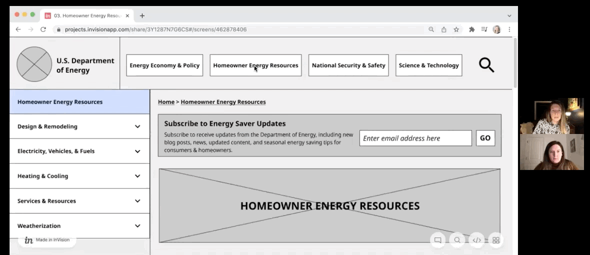
Once the sitemap was developed, I created new navigation menus for the header and footer. I included tertiary menu options in this as well, since some of those were part of the initial user testing that I completed. Tertiary options really only appeared within the homeowner/consumer section of the website, which makes sense when you think about it from a functional perspective. The Dept. of Energy has a lot to say to the general public about their action steps for energy consumption and options, but much less when it comes to things like nuclear security & national safety.
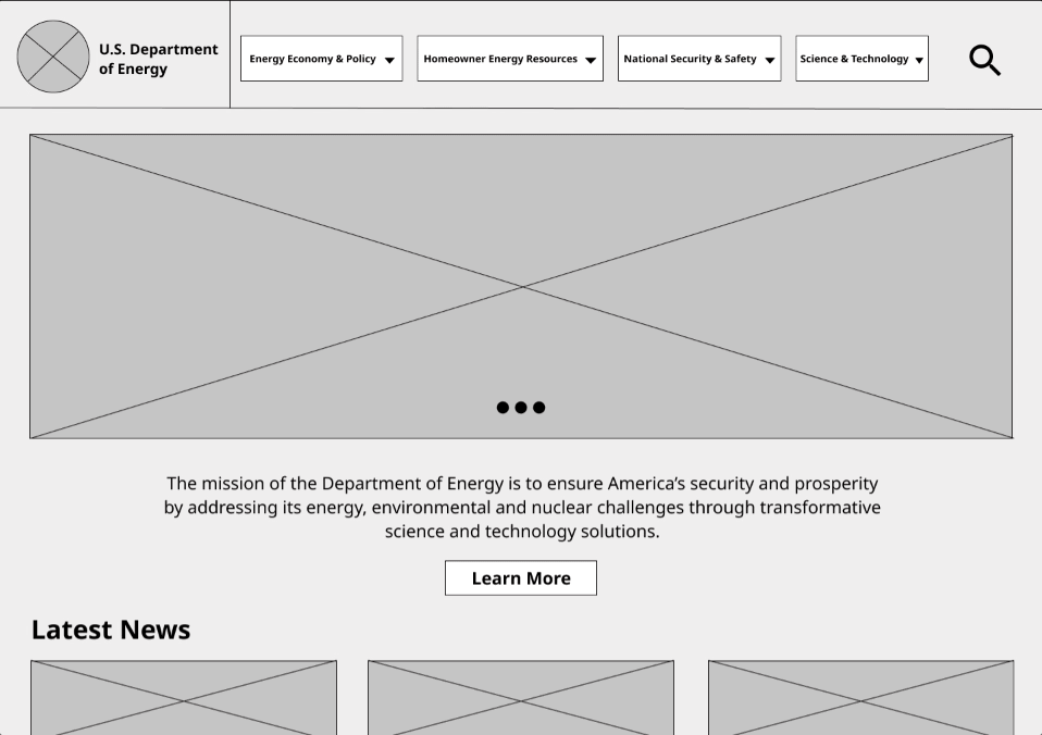
New page templates were also developed during this phase, and they included elements like breadcrumbs, clear calls to action, hero images, and content cards. By utilizing consistent templates for pages across the site, the user becomes accustomed to knowing where to look for information and understanding which actions they should take. Finally, I translated the templates for the desktop site to mobile in order to make the web design more responsive.


User Testing & Iterations
With my wireframes in place, I began testing my prototype for the new site. Sample users provided excellent feedback on tweaks that needed to be made for clarity. One example of this are simplifying some of the menu category names, which allowed me to make the menu text larger, and allow the user to navigate more quickly by having less to interpret.


Top: Version 1 of the header menu, Bottom: Version 2 after testing
UI Styling & Mockups
Once I had my wireframes in a good place, I moved on to redesigning the visual elements of the site, such as color, typography, imagry, and iconography. In determining design choices, I wanted to pay respect to time-honored American ingenuity and tradition while also embracing the latest technological and scientific advances to best meet our future climate and resource needs. I also wanted to use a color scheme that evoked the colors in the current department of energy logo, but also natural elements.


The Department of Energy website does not currently have uniform fonts, iconography, or imagery. The style guide I put together would hopefully create a more consistent use of style and tone across the site.


All of these elements came together to inform how the mockups of the new site would look. I tested these mockups with users and made changes to my useage of color before landing on my final design.
